
THE FACE of the MINI brand is changing after nearly 20 years, with new badging for all models in the range from March 2018.
Instead of the 3D representation interpreting the old badge the new logo is a simplified, minimalist, 2D or flat design version retaining the key elements of the winged wheel with name in capitals.
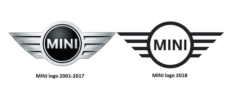
Announcing the change, the BMW Group company says: “The new MINI logo draws on the three-dimensional style of depiction that has existed since the relaunch of the brand in 2001.”
It adds: “The preservation of the fundamental, tradition-steeped motif of a winged wheel with the brand name printed in capital letters at the centre ensures the logo will be instantly recognised.
“The deliberate avoidance of shading and grey tones creates a starkly contrasting black-and-white effect that conveys the authenticity and clarity of the new brand identity, its two-dimensional character also allowing universal application.”
The new logo will be applied as a product label to all MINI models – on the bonnet, at the rear, at the centre of the steering wheel and on the remote control.
The latest redesign ushers in another chapter in the varied history of the MINI brand logo. There is an especially striking similarity with the signet introduced for the classic Mini in the mid-1990s. At that time, the brand name also appeared in uppercase letters in the middle of a circle with stylised wings.
This combination of the wheel and wing symbols dates back to the very early years of the classic Mini. When the British Motor Corporation (BMC) put the Morris Mini-Minor on the market together with the structurally identical Austin Seven in 1959, the former bore the logo of the Morris brand.
This featured a red ox and three blue waves – the symbol of the city of Oxford – which appeared inside a circle with two stylised wings to the left and right. By contrast, the sibling Austin Mini from 1962 onwards bore its hexagonal logo above the radiator grille, showing the brand’s inscription and emblem.
Two other individual variants of the revolutionary small car also appeared under other BMC brand names as Wolseley Hornet and Riley Elf, each with their own distinctive brand logo in each case.
It was not until 1969 that the multiple identity of the classic Mini came to an end. From then on it was produced solely at the Longbridge plant in the UK and at the same time was given the sole, illustrious model designation of Mini.

To mark this step, the classic Mini was also given a new logo: the motif here was a classic emblem featuring an abstract design that had no similarity at all with the original symbols.
The so-called Mini shield remained in use for decades, its design being adapted on a number of occasions. Numerous special classic Mini models were given individually designed logos, though all of them were based on the universal emblem format.
The new edition of the Mini Cooper in 1990 saw a change to these strict principles: there was now a return to traditional logo design and a focus on the sporting merits of the classic Mini.
A chrome-plated wheel with stylised wings echoed the Morris Mini-Minor logo, but instead of the ox and waves, the red inscription “MINI COOPER” now appeared with a green laurel wreath against a white background. In 1996 this variant was then applied to the other models with a modified background and the inscription “MINI” – the light inscription standing out against a green background.
Just a few years later during relaunch preparations for the brand – which today belongs to the BMW Group – the decision was made to redefine not just the MINI identity but also its logo. In this case, the logo design most recently used for the classic Mini was taken as a basis and consistently modernised.
At its premiere in November 2000 the modern MINI appeared with a high-quality, three-dimensional logo design featuring the brand inscription in white against a black background.
The chrome wheel and stylised wings remained unchanged for nearly 15 years and became the globally familiar symbol of driving fun, individual style and premium quality in a small car of the 21st century.
The company says the new MINI logo likewise reflects a clear commitment to the tradition of the British brand, which now stretches back almost 60 years, with a range that is changing both in drivetrains to embrace the electric era, but also in size.